2023
UX Researcher & Designer on a team of 4
Figma, Google Suite, User Personas, Heuristics, Competitor Analysis, Field Study
The client, MSU Libraries, requested a evaluation and redesign of its digital library signs.

Three research methods were employed to gather data for the client: heuristics, field study, and competitor analysis. These methods were chosen to gain a better understanding of the structure of the library signage and how it can be improved.

Using Nielsen's 10 Heuristics for interaction design, my team and I evaluated the current digital library signs to determine successes and shortcomings. Click the link to view the full report.

Next, an in-depth field study with three random users. This study yielded insight into how users were interacting with the signs in real time. Click the link to view the full report.

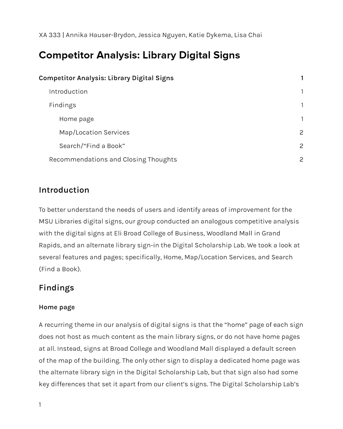
Finally, a competitor analysis was conducted to evaluate the successes and shortcomings of other digital signage. Click the link to view the full report.
Before the final designs were created, user personas were made based off of the expected users of the digital library signs. Each team member contributed one persona. Three of the personas are related to the university, while one is a community persona. The personas were created this way to reflect the variety of people in East Lansing who interact with MSU Libraries. These personas became useful tools when developing the final prototype.


Using the collected data, our team collaboratively developed new interfaces for the "Find a Book," "Maps," "Ask a Librarian," and "Events" pages of the library signs Below is a carousel of the final designs.
Paired with the design solutions above, it was recommended that the physical responsiveness of the digital library signs be improved alongside their structural hierarchy. The data and solutions were well-received by the client, and the process of creating them generated experience in UX Research.